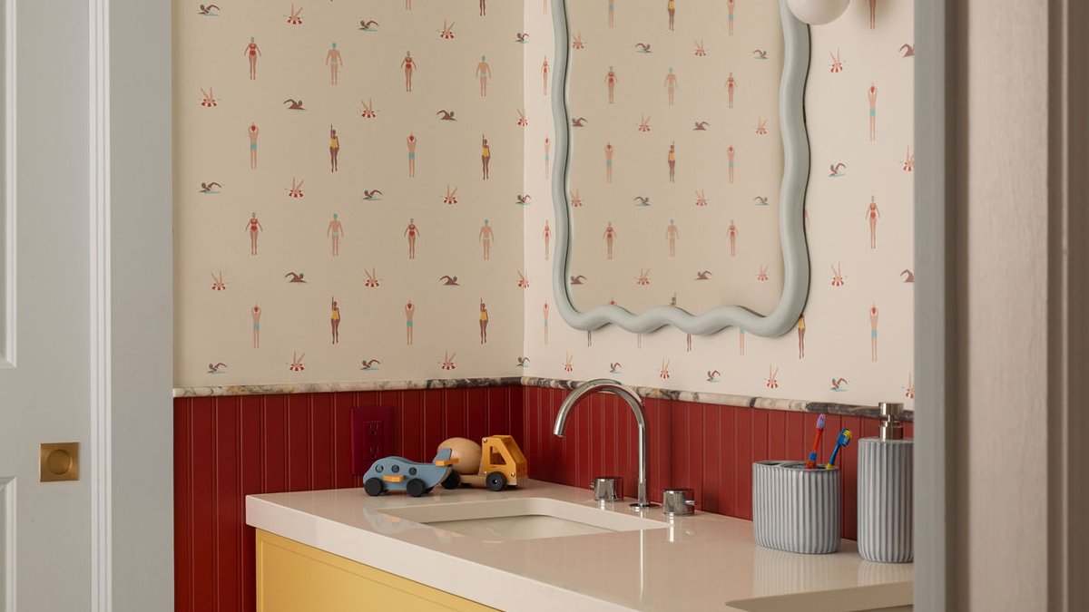
Ottawa bathroom redesign sparked by an Etsy print shows how a single artwork can shape an entire renovation.
From a Loved Print to a Fresh Layout
Clients brought a print they had bought on Etsy, titled “Le Homard Saint‑Malo,” into the initial design conversation. Co‑founder and principal of Studio Alter, Kate DuBois, called the piece “the best kind of starting point,” noting that a real object already in the home can guide the design direction.
Studio Alter, run by DuBois and fellow principal designer Xenia Rose, is known for crafting thoughtful interiors. The team saw the lobster illustration as a cue to add whimsy to a functional family bathroom, turning a routine room into something reminiscent of a sunny postcard.
The family had just welcomed a fourth child, and the bathroom sits between two boys’ bedrooms. Rose explained the need for durability that could withstand “actual kid use while still feeling considered.” The brief called for color and personality that wouldn’t feel too juvenile as the children grew.
Materials, Colors and Custom Details
Renovation work covered everything from layout planning to construction management. “We took it from layout all the way through construction management,” DuBois said, adding that the firm handled design, selections, and procurement.
One of the first pieces noticed is a custom vanity supplied by House of Fine Carpentry. The turned legs, sourced from Pretty Pegs, give the piece a furniture‑like presence, according to Rose. Mirrors in a wavy blue‑grey finish from HVS Home add a playful touch without overwhelming the space.
Designers also commissioned a hand‑drawn wallpaper featuring swimmers and beachgoers, printed through Spoonflower. The pattern sits above deep red beadboard wainscoting, while marble trim tile from Calacatta Tile creates a visual link between the two. A red Triple Seven Home sconce ties the color story back to earth tones.
Related: Black family reimagines Florida home with Caribbean roots
Balancing red, butter yellow, dusty blue, and the busy wallpaper required careful placement. The team “was deliberate about where each color landed and how the materials layered so it felt rich rather than chaotic,” they said.
In the middle of the project, it became clear that the design’s success hinged on more than aesthetics. The family’s willingness to accept bold hues and the designers’ collaborative approach meant decisions could be made quickly, keeping the schedule tight. This collaboration, while not guaranteed in every remodel, suggests that clear communication can streamline even detailed undertakings.
All elements came together without major setbacks. The renovation proceeded smoothly, a point the designers attribute to the clients’ good instincts and the trust built between parties.
Final Look and Reception
The finished bathroom blends playful and polished elements. The custom vanity draws immediate attention, while the patterned wallpaper adds a narrative layer that references the original lobster print.
Red accents recede into the background, allowing the butter‑yellow and blue‑grey tones to dominate the visual field.
The result feels cohesive.
Visitors to the home note that the space feels “like a postcard from somewhere sunny,” echoing the designers’ original intent. The renovation demonstrates how a personal artwork can inspire a broader design language, turning a utilitarian room into a standout feature.